
Modernizing MDLand
THE PROBLEM
Healthcare is where good software goes to be ignored.
The tools clinicians use every day are often technically capable but visually stuck in 2014. Not because the companies behind them are behind, but because the website never caught up to the product.

iClinic® is one of the most feature-complete EHR platforms in its market.
ONC-certified, used by 800+ clinics, trusted by NYU Langone, NYC Health, and the NY Department of Health. Founded by physicians in 1999, it's an AI documentation tool that reduced charting time by 81%. The only EHR in its market with government-level SDOH infrastructure tied to New York's 1115 Medicaid Waiver.
Its website did not reflect any of that.
RESEARCH
Initial gaps and broken links
What I found on day one:
7
broken nav links
2
broken conversion paths
1
live placeholder page

Understanding who actually visits this site
Before touching anything, I mapped intent over job title. Three distinct users emerged:
01.
Buyers: Practice Owners, MSO executives, IPA leaders
Needs:
Clear product map
Business outcomes
Credibility
Fast way to request demo
02.
Clinicians: Physician, Care coordinator, Specialist
Needs:
Workflow-oriented examples
Metric/tangible proof
Examples/Demos
03.
Prospective Partner: Health system executive, Medicaid program lead
Needs:
Program-level proof, technical depth, direct human contact
Workflow-oriented examples
Easy access to how products work
From building the design system to editing the entire web infrastructure
Over ten stakeholder interviews across clinical, billing, and enterprise teams changed my initial thinking. Every internal stakeholder described their product in different language and organized around different mental models:
Billing called it a claims platform
Clinical called it a documentation tool
Enterprise called it a care management system
Which made me realize that different audiences are coming for completely different things, and they want to easily and speedily access that information.
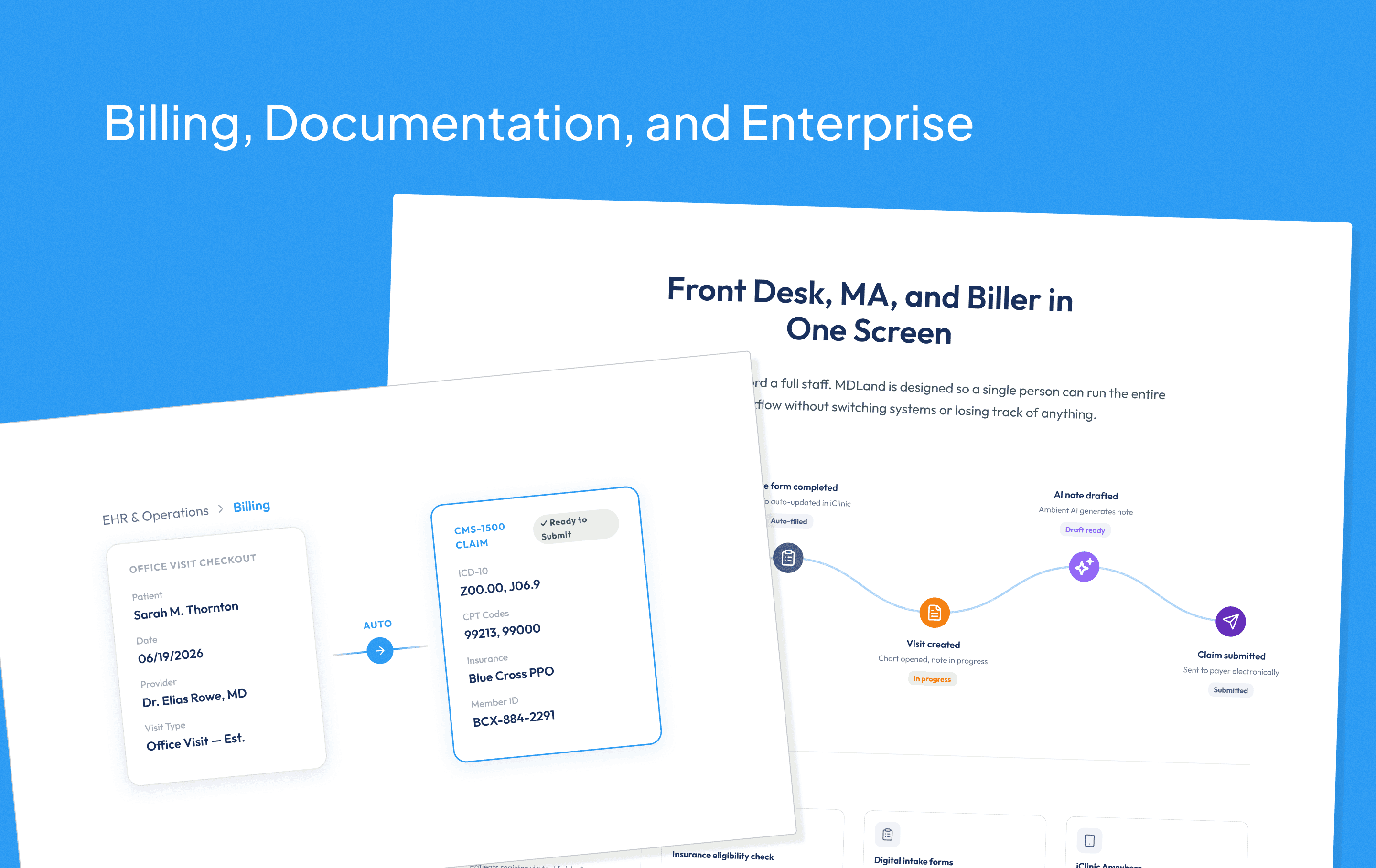
So I redesigned the navigation to work two ways: by product, and by the problem they came to solve.
What the competition was doing
I ran a full analysis of different competitors like DrChrono, NexHealth, and athenahealth. The pattern was consistent: similar products communicated more clearly than MDLand's.


DESIGN PROCESS
A website is composed of navigation, information, and design
The interviews gave me three design directions worth building towards.
Navigation is the key in user retention
The old nav was simple because the old site was thin and barely scratched the surface of what MDLand offered. The new site needed to hold significantly more pages so a clinician and an enterprise IT director could both land on the same nav and immediately find their own way in.


AI equates to time.
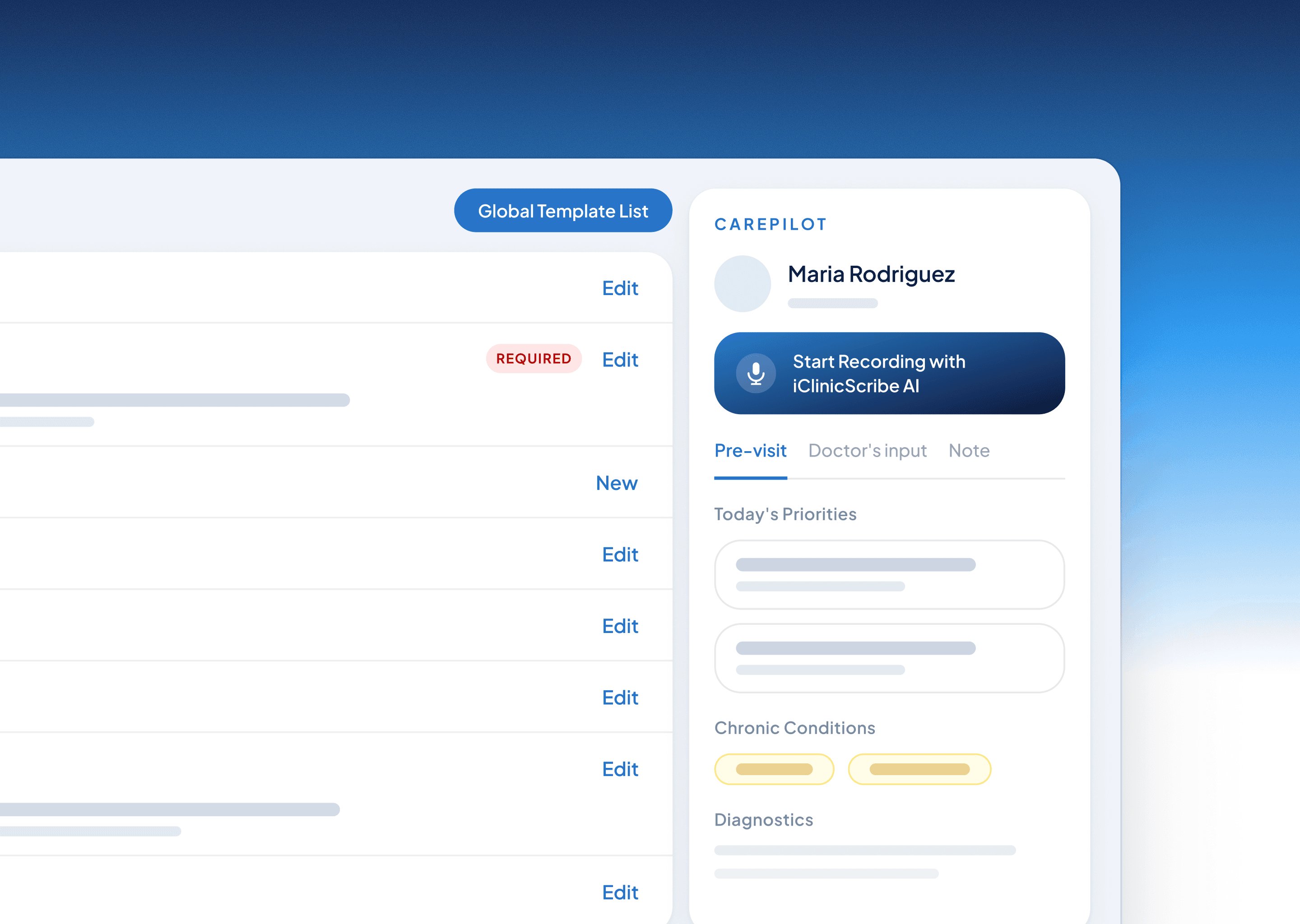
Despite being forward-thinking and keeping up with the tech industry, MDLand's AI sector was buried as a single offhand line. I pulled it into its own dedicated section, separated use cases, and led with the outcome: time back from documentation.

Relevance beats comprehensiveness
Each audience page was built backwards from that group's specific pain points. Rather than listing MDLand's full product suite, I mapped only the tools that addressed each group's top problems. A solo practitioner should land on that page and immediately think "this is about me."
KEY TAKEAWAYS
Three things I'm taking with me:
A website is a product. It has users, conversion paths, and failure states. Treating it like a brochure is why most company websites don't work.
Evidence moves stakeholders more than instinct. Every recommendation was grounded in something I could show.
The product being good is not enough. The gap between what a product does and what a visitor believes it does is a design problem. That's what this project was really solving.
Want to create something?