
Platr: tool for dietary needs
THE APP FOR DIETARY NEEDS

THE PROBLEM
A student with celiac disease stands in line at the campus food court, unsure what's safe to eat.
The dining website is outdated, staff don't know about cross-contamination, and she's already skipped two meals this week. As students ourselves, we recognized this wasn't an edge case, it was a daily reality for students with dietary restrictions.

Students with dietary restrictions have no centralized platform.
There's no app in providing accurate allergen information, turning simple dining decisions into daily sources of stress and potential harm.

THE SOLUTION
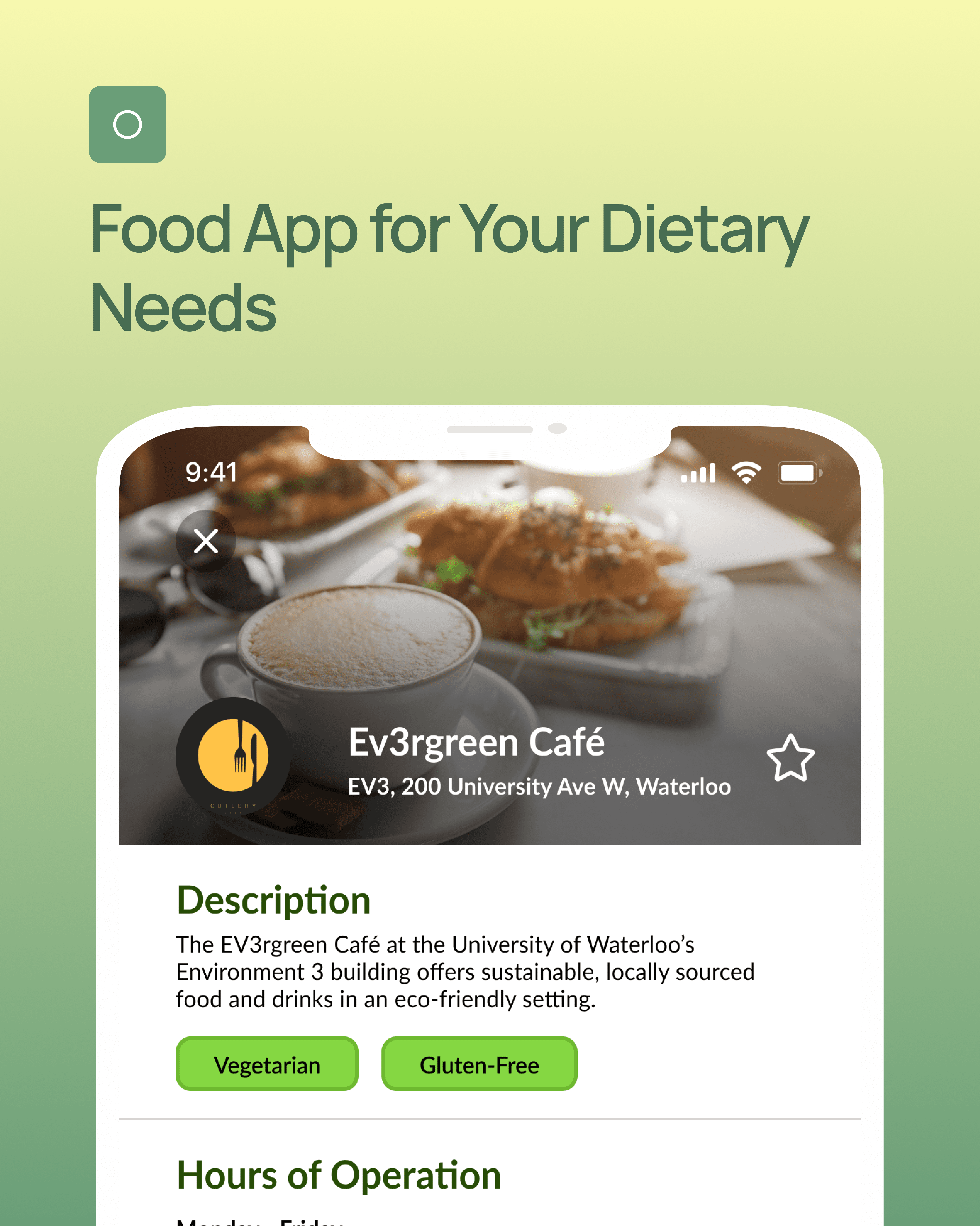
Platr helps University of Waterloo students discover on-campus dining options aligned with their dietary needs through personalized filtering, real-time updates, and detailed menus

KEY PAIN POINTS
Research Insights That Shaped Our Direction
Through our interviews, three critical patterns emerged:
⚠️
Safety isn't negotiable, but strictness varies: Students with severe allergies need ironclad defaults, while those with lifestyle preferences (vegetarian, low-carb) want flexibility to explore options outside their usual choices.
📖
Information needs to be immediate: Students make dining decisions in under 2 minutes while standing in line or walking between classes. Lengthy navigation kills the experience.
🔒
Trust comes from transparency: Students told us they'd rather see "no safe options" than be given false confidence. Honesty about ingredients and preparation methods was non-negotiable.
Our team initially set out to design a more generalized food app, but after conducting a campus-wide interview and discovering that students face:
❌ Unclear dietary options
❌ Poor Location Awareness
❌ Limited accessibility aid functions
❌ Low Budgets
We realized that trying to cover everything at once would make our app overly cluttered and generic, ultimately resembling other food apps like Uber Eats. Therefore, we chose to focus on a specific niche: offering dietary-friendly information about on-campus dining options.
DESIGN PROCESS
Low-Fidelity to High-Fidelity
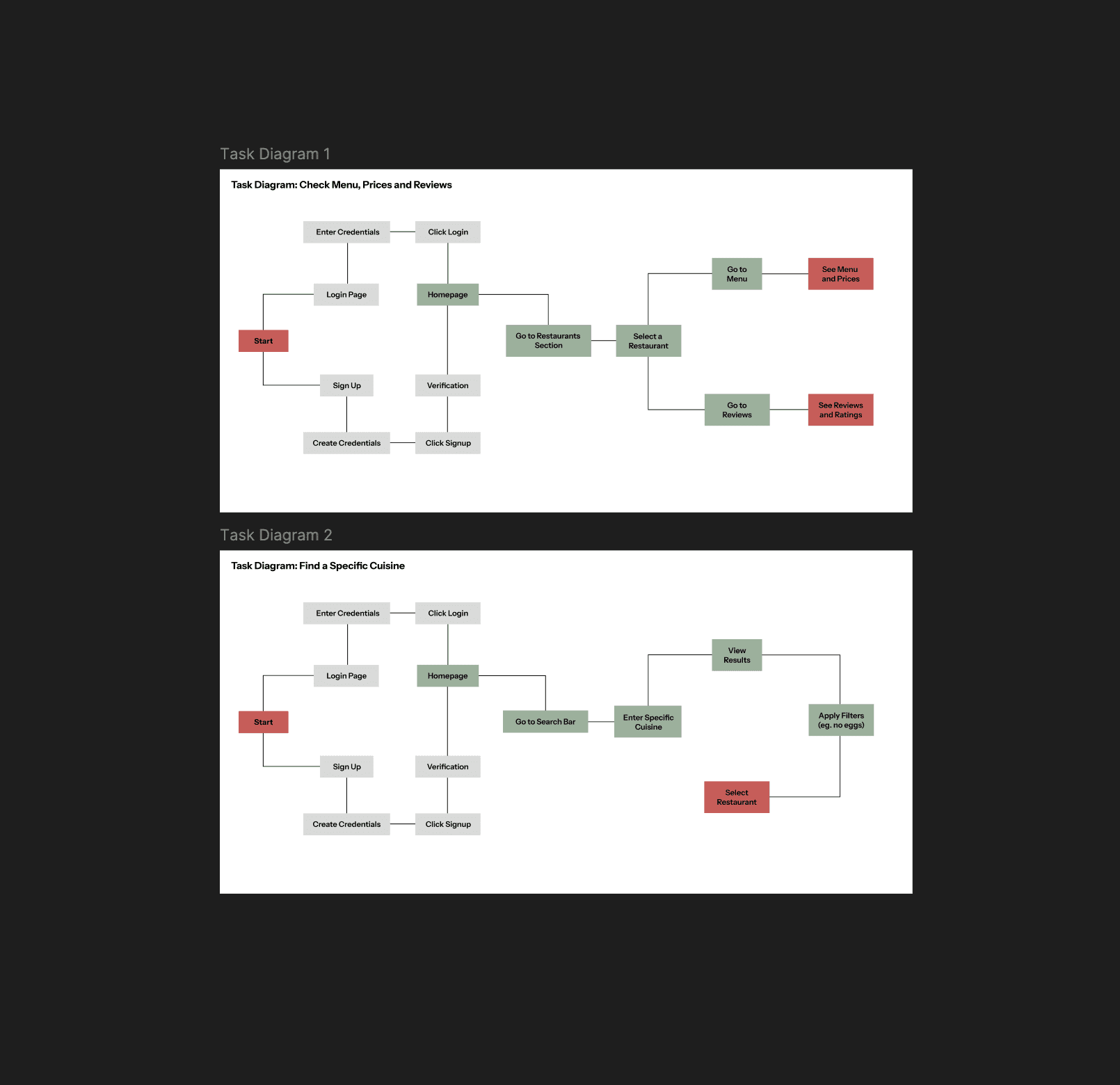
During our low-fidelity prototyping phase, we conducted anonymous internal reviews to evaluate each member’s design solution. Despite differences in execution, a strong common thread emerged: a focus on personalization through dietary-based onboarding. This collaborative process shaped the foundation of our high-fidelity design. Key understandings and design refinements include:
Customizable Onboarding (Member 1):
Introduced a login system allowing users to set dietary restrictions and allergies.
Included a detailed list of specific food options, which was well-received by the group.
Led to a design refinement: separating allergies (ingredient-specific) and dietary restrictions (broader lifestyle or medical needs) into two distinct onboarding pages for clarity.
Smart Filtering and Default Preferences (Member 2):
Focused on filtering restaurants based on preset dietary needs to streamline the user experience.
Inspired us to remove redundant dropdown menus and instead:
Automatically apply dietary restrictions from onboarding to the browsing page.
Ensure the app reverts to default preferences upon page refresh
Editable Tags and User Profile Separation (Member 3):
Proposed dashboard-based editing of dietary filters.
Team critique led to an improved solution:
Kept onboarding focused and consistent.
Moved editable filters to a dedicated section within the user profile to avoid cluttering the homepage.
Homepage Filter Toggles (Member 4):
Reinforced the idea of toggling dietary filters on the homepage for flexibility.
Supported our final decision to distinguish between onboarding presets and casual cuisine tags.
Low fidelity user flows


High-Fidelity Improvements
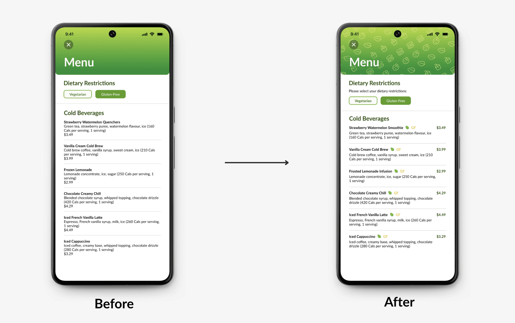
Through collaborative iteration, we developed a more intuitive and inclusive high-fidelity prototype. By aligning on the separation of default dietary needs and flexible filters, we enhanced both clarity and user control. Platr distinguishes itself from mainstream food delivery apps by:
Catering to users with dietary restrictions through personalized onboarding.
Offering flexibility via homepage filter toggles without compromising defaults.
Providing a focused, campus-specific dining experience built around user needs.


SOLUTION
By prioritizing dietary accessibility, real-time updates, and user-friendly filtering, the app empowers students to make confident food choices without unnecessary stress.
Platr successfully addresses the challenges University of Waterloo students face when navigating on-campus dining.
Future Considerations
Expand restaurant partnerships for more dynamic menu updates.
Integrate a crowdsourcing feature for user-submitted allergen warnings.
Explore partnerships with other universities to scale the solution.
Key Takeaways
✅ Personalization is crucial – Users appreciated tailored recommendations based on their dietary needs.
✅ Clarity reduces frustration – Simplifying UI elements (e.g., filters, menus) improved usability.
✅ Real-time updates build trust – Students valued accurate information on closures and promotions.


Want to create something?