
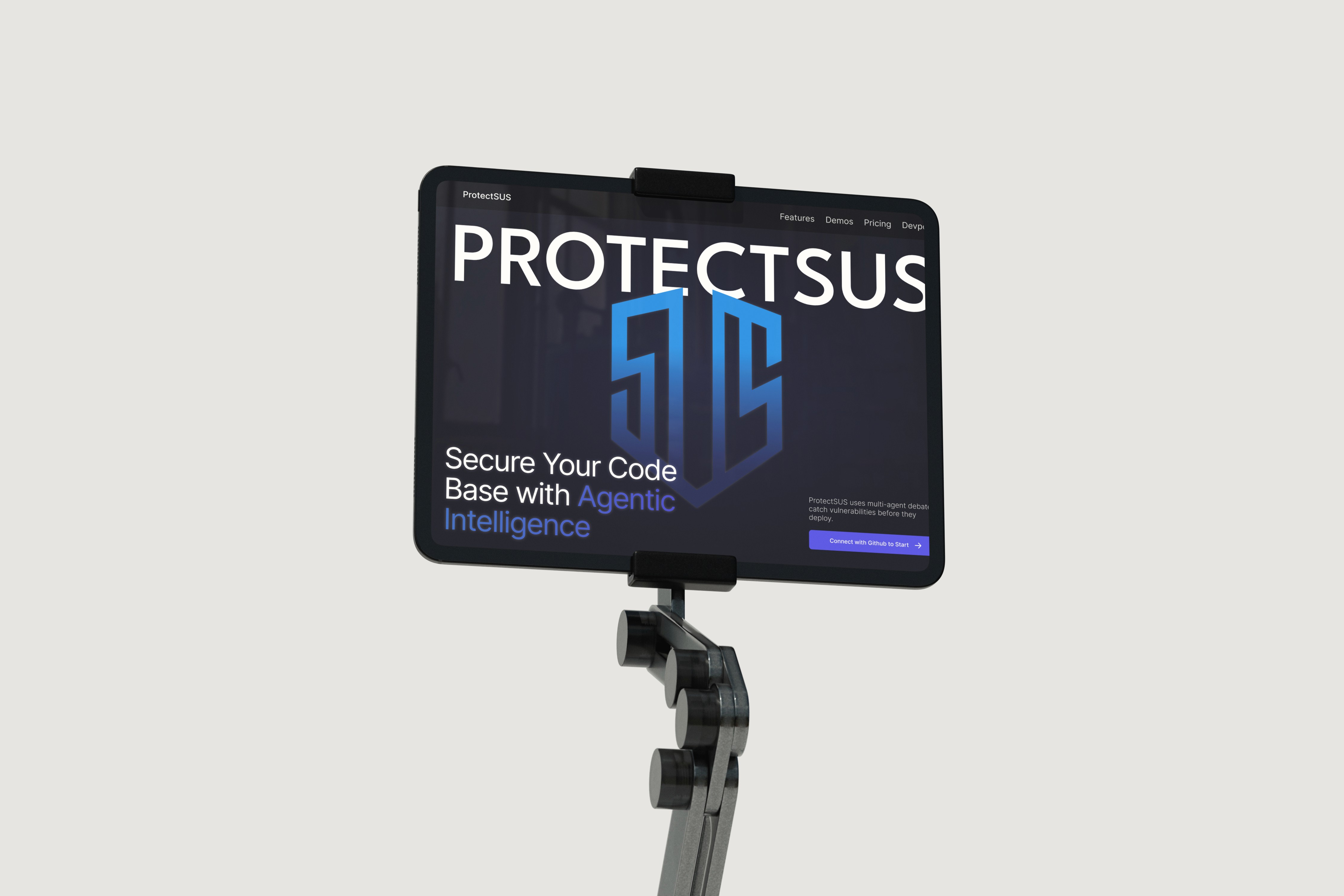

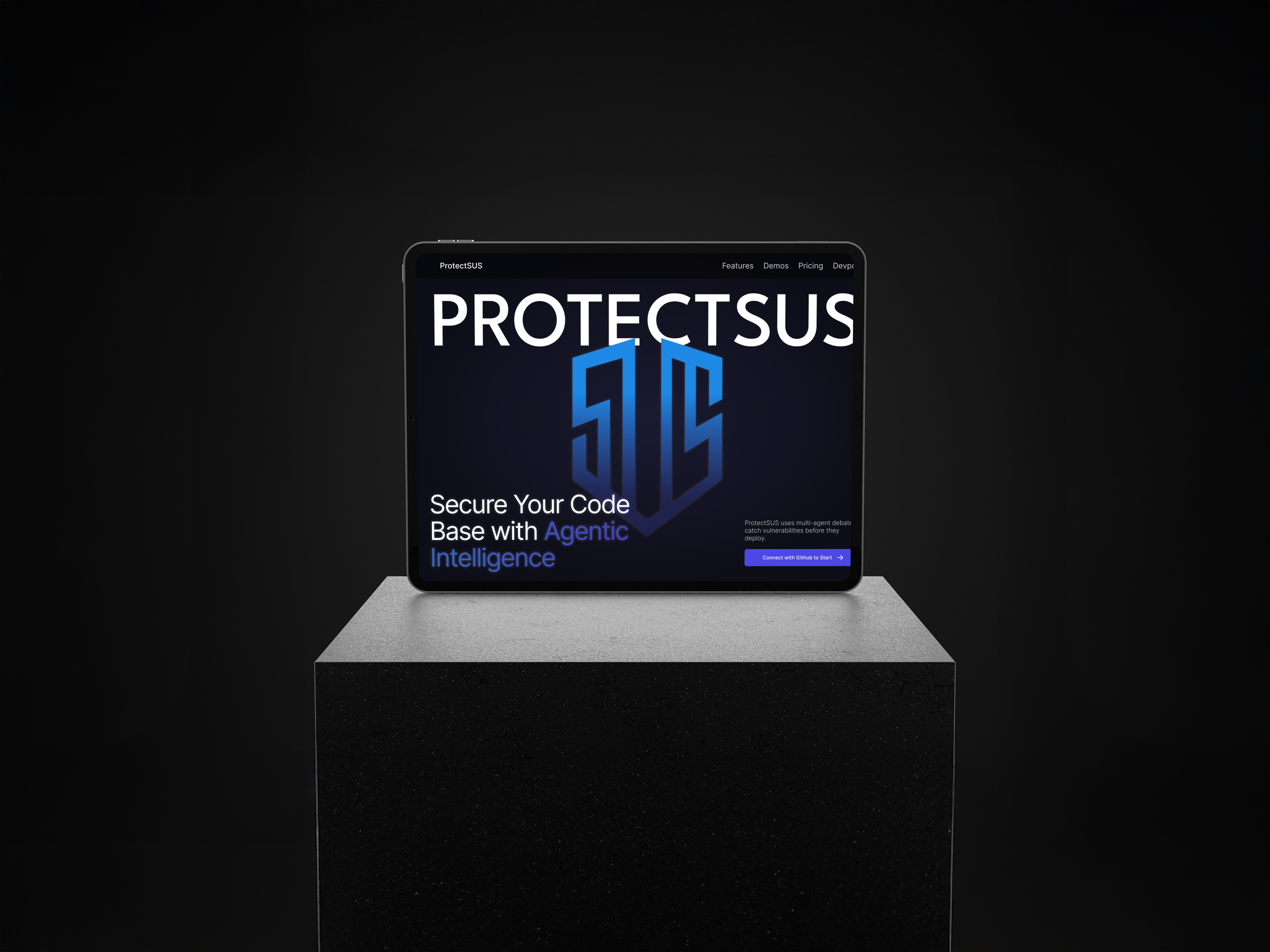
PROTECTSUS
PROTECT US FROM SUS
2025 Rogers Design Hackathon
ROLE
UX/UI Designer
Frontend Devloper
TOOLS
Adobe Illustrator
Figma
VS Code
TRAE
ORGANIZATION
NexHacks
MongoDB
Github
Next.js
Tailwind
2025 Rogers Design Hackathon
001: OVERVIEW
Every day, security teams drown in thousands of vulnerability alerts. Most are false positives. Some are critical. But which ones? By the time humans manually assess severity, context, and exploitability for each threat, attackers have already moved. The gap between detection and action is where breaches happen.
In 2024, 90% of tech organizations got hacked and 90% of those breaches traced back to human error. The average cost? $4.5 million

002: PLANNING
Research Insights That Shaped Our Direction
What made this hackathon unique was that we weren't handed a problem statement, rather we had to find our own. That meant starting from a blank slate: researching real-world pain points, identifying gaps, and deciding what was actually worth solving. It mirrored startup culture more than a typical hackathon, where the hardest part isn't building the solution, it's figuring out what to build in the first place. After rounds of research and debate, these were the initial ideas we landed on:
Forma
AI kinesiologist that uses computer vision to track movements and deliver real-time voice feedback on exercise form.
MedVeritas
AI safety layer that flags diabetes chatbot responses likely to cause hypoglycemia, offering context-aware warnings and safer alternatives
ProofRx
Real-time detector that flags health misinformation, conflicts of interest, and provides instant fact-checks with clinical citations
ds
All of these were strong ideas, but in a 48-hour hackathon design sprint, we had to be realistic:
1.
Could we actually test and validate the core functionality with real data?
2.
Would the demo work reliably in front of judges, or would we be crossing our fingers?
3.
Could we build both a polished frontend and a functional backend that actually solves the problem?
The healthcare ideas required computer vision calibration, medical data simulation, and real-time audio processing, any of which could fail spectacularly during a live demo. ProtectSUS, on the other hand, leveraged existing infrastructure (GitHub API, vulnerability databases) and had a clear success metric: scan code, find vulnerabilities, generate fixes. We chose the idea we could ship completely, not just mock up.
This taught me to take the environment into consideration, a very real problem when working in corporate teams, where you not only have time constraints, but also have to collaborate with others' progress and navigate monetary restrictions.
003: PROCESS
My Role:
I worked on the frontend collaboratively with one other teammate, while the remaining two members owned the backend. My contributions spanned the full frontend: from early brainstorming and low-fidelity sketches in Figma, through to mid-fidelity iterations, visual design, and coding the final interfaces. The design decisions around layout, color, and component structure were largely mine to drive, in close coordination with the backend team to ensure what we built was actually connectable.
Going into the design phase, our main direction was simplicity. With only a few minutes to present, the interface had to communicate the product's value almost instantly. Judges shouldn't have to think, they should just get it. Every design decision was filtered through one question:
Can someone understand what this does in seconds?
That said, we didn't want to build something that felt like a prototype. We included additions like a pricing page to signal real-world scalability and show that we'd thought beyond the hackathon. The core user flow had to be razor sharp, but the supporting pages gave it legitimacy.
For the visual direction, we drew inspiration from similar tools in the security space and researched color psychology to inform our palette. We landed on a blue-to-purple gradient ranging from #61A3FB to #4F47E6: blue to convey trust and technical credibility, purple to signal intelligence and innovation. Together they gave the product a polished, modern feel that aligned with the AI-forward nature of the tool.

From there we mapped out the key screens and started with low-fidelity sketches to nail the layout before committing to anything visually.
Inspiration:
Low Fidelities:


-
Design Decisions:
One of the trickier parts of the design process was working around backend uncertainty. Since we didn't always know which features would make it into the final build in time, we had to design defensively, building layouts that could flex if a feature got cut without the whole interface falling apart. For example, we weren't sure how long the AI debate outputs would be, which meant certain components had to be designed with variable content in mind from the start.

A key iteration we debated was whether to include summary cards on the results page displaying severity level, critical issue count, and similar metrics. The question was whether they added genuine value or just visual noise on top of the agentic AI chatbot. We ultimately kept them so that a judge scanning the screen for five seconds could have something to anchor on and the cards gave instant context that the chatbot alone couldn't provide.

004: CHALLENGES
Responsiveness:
The biggest recurring challenge was responsive design. Getting each page to display correctly across both web and mobile took far more iteration than expected, with certain layouts breaking or misaligning depending on the screen size. In a hackathon setting where time is everything, debugging layout issues that only appear on certain viewports was a particularly frustrating part.
Layout:
The other major pivot came from the dynamic nature of the AI outputs. Because the length of the debate responses was an estimate at best, components like the chatbox had to be reworked mid-build by converting static containers into scrollable ones to gracefully handle responses of any length. It was a small fix in hindsight, but it's a good example of how designing around AI-generated content requires more flexibility than designing around a static copy.
005: SOLUTION
