

INCLUSIVE REBRANDING
STAEDTLER REBRANDING PROJECT
2025 Rogers Design Hackathon
ROLE
Graphic Designer
Product Designer
TOOLS
Adobe Express
Adobe Illustrator
Adobe Photoshop
Adobe After Effects
COMPANY
Staedtler
DURATION
2 weeks
2025 Rogers Design Hackathon
PART 1:
OVERVIEW
For over 180 years, Staedtler has been dedicated to inspiring creativity in people of all ages worldwide. They advertise high-quality and affordable products to try to unlock everyone's natural drive to explore, create, and express themselves. Staedtler promotes itself as a brand that appeals to "all ages," emphasizing that no one is ever too young or too old to use writing tools. However, their statistics show that their primary users are teenagers and young adults. As a result, their target audience is generally perceived to be students, particularly those aged 12-22. While their products—writing and art supplies—aren't gender-specific, they are distinctly marketed toward artists. In this case study, I worked on rebranding this company to something more community and inclusivity suited.

PART 2:
PROBLEM
Staedtler’s current brand identity aims to inspire strength, creativity, and determination across all age groups globally. The logo, featuring the Mars head inspired by the Roman god of war, symbolizes this ethos. However, while the message is motivating, the logo’s connection to the brand’s core purpose isn’t immediately clear, nor does it effectively communicate the brand’s focus on art supplies. Moreover, although Staedtler claims to nurture new and aspiring artists, its packaging predominantly features high-level masterpieces, which may feel unapproachable for beginners. Through altering the way Staedtler packages their products and advertises their social media, I aim to make the brand feel more inclusive and aligned with the artistic community as a whole. Throughout this project, I worked to solve:
PART 3:
DESIGN
PROCESS
3.1 Logo Redesign
After defining the direction for the rebranding, I began by tackling the logo design. This proved to be the most challenging aspect of the project, as I found myself overly focused on the existing design and how to build upon it. This constrained my creativity, making it difficult to think outside the box and explore fresh ideas.
Staedtler’s current logo features a Mars head facing left, symbolizing strength, creativity, and determination. The design is divided into three distinct sections: the helmet crest, the helmet, and the head. While the logo aligns with the brand’s motto of inspiring innovation, reliability, and artistic expression, it fails to clearly communicate Staedtler’s identity as a stationery and art supply company. Without prior knowledge of the brand, the Mars head could easily be misinterpreted as representing a military or weapons company rather than one focused on creativity and art.

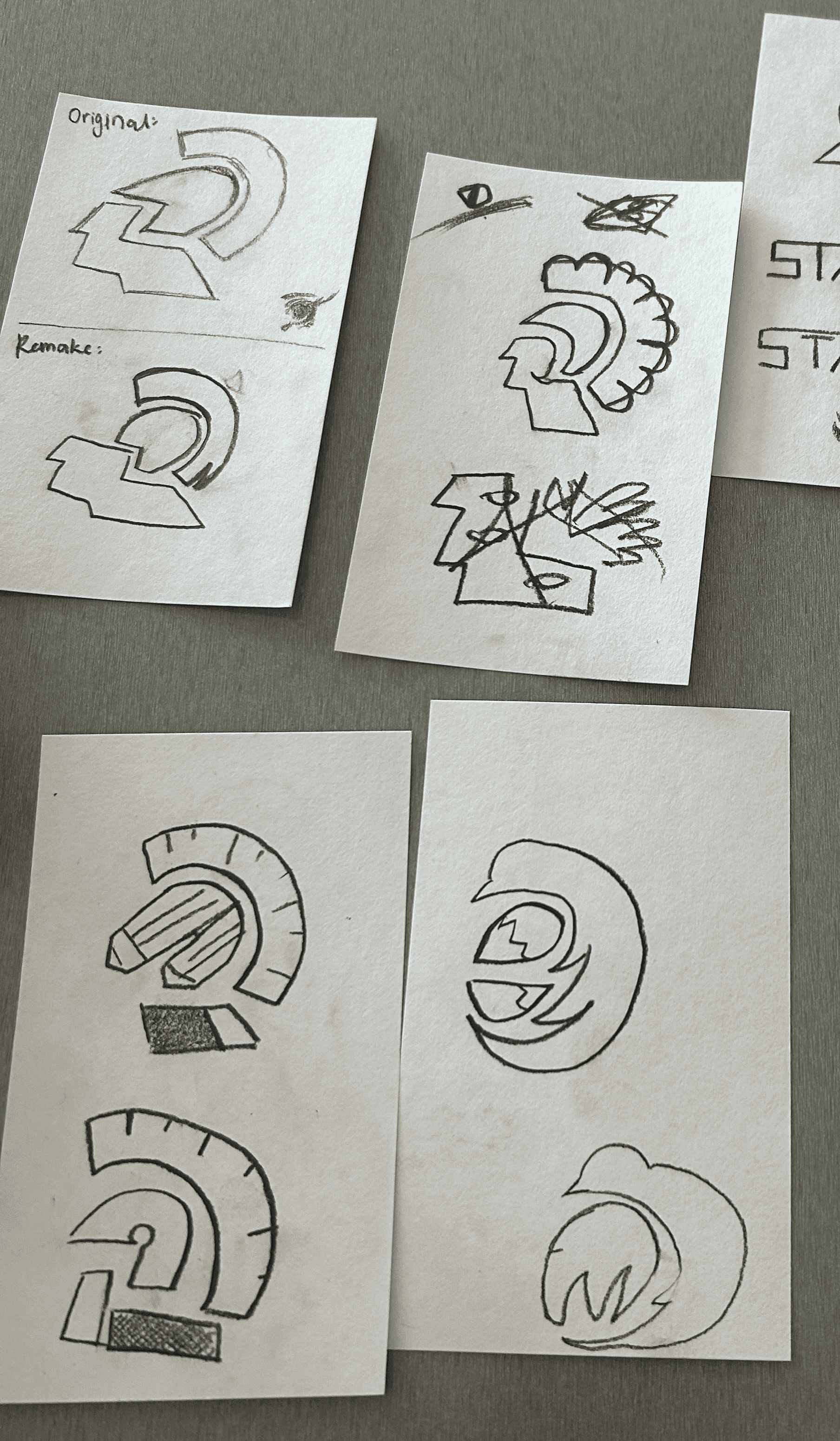
During the redesign process, I experimented with numerous iterations of the existing logo, attempting to incorporate stationery elements into the Mars head design. However, these attempts often resulted in cluttered and unappealing visuals. Trying to retain the original shape while integrating new ideas felt forced and counterproductive. Realizing this, I decided to clear my mind and start the design process anew, this time exploring a completely different direction. I asked myself: If I were to design a logo from scratch, what would it look like?
The result is a redesigned logo that incorporates three key elements:
The letter "S": Representing Staedtler as the core identity.
A shield shape: Symbolizing reliability and the courage to embark on creative journeys.
A pencil: Encircled and "protected" by the "S" shield, clearly communicating Staedtler’s focus as a stationery and art brand.
This new design not only aligns with Staedtler’s values but also ensures that the brand’s purpose is immediately clear to both existing and new audiences.
PART 4:
SOLUTION
After creating the new logo and products, the last step is to actually get community engagement. I decided to acheive this through a Social Campaign Strategy.
The goal of the social campaign is to foster a sense of community, inclusivity, and creativity among artists of all skill levels. By leveraging platforms like TikTok, Instagram, and YouTube, Staedtler can engage its audience in meaningful ways while aligning with its rebranding goals.
Key Strategies:
Community Engagement:
Encourage user-generated content by inviting artists to share their work using Staedtler products. This will create a sense of belonging and strengthen the brand’s connection with its audience.
How-To Tutorials:
Develop engaging how-to clips featuring voiceovers and step-by-step instructions using Staedtler products. These tutorials will cater to artists of all levels, making the brand more approachable and accessible.
Collaborative Art Wall:
Create an interactive "art wall" where individuals can contribute their own drawings using Staedtler products. This collaborative space will showcase the diversity of artistic talent and encourage community participation. The process will be documented and shared on social media to drive engagement and highlight the brand’s role in bringing people together.
Progress Clips:
Produce time-lapse videos showcasing the journey of amateur artists evolving into skilled creators using Staedtler products. These clips will not only demonstrate the quality and reliability of the products but also inspire and motivate aspiring artists. By emphasizing growth and transformation, Staedtler can position itself as a trusted partner in the creative process.
Want to create something?